Tabule
Research ⋅ Wireframe ⋅ Prototype ⋅ Interaction Design ⋅ Visual Design ⋅ Development
Summary
Tabule is a smarter homework planner for college students to effortlessly manage their assignments and workload. It began as a research project and eventually evolved into a rapidly growing and funded startup. I was responsible for all aspects of the project, from ideation to execution.
An early marketing video for Tabule
This case study takes about 7 minutes to read, or you can just look at the pretty pictures. You can also skip History and jump straight to the design process to save 2 minutes.
History
In Spring 2010, I received funding and support from Illinois Tech’s administration to work with professors and observe how bringing iPads into the classroom impacted learning and productivity. For example, I noticed that students participated more when using an iPad than a laptop because the laptop screen created a physical barrier between them and the teacher.
Tabule v1
Although it was great for increasing engagement, the iPad lacked classroom-specific software. Applying my user research, I designed and developed a barebones web app prototype of a rapid response system for in-class quizzing. The system was meant to replace physical clickers for teachers to quickly assess understanding. The benefits of using Tabule were instant scoring and feedback, easier setup, the ability to ask more complex questions than just multiple choice, and universal device support, since it worked on anything with a standards-compliant web browser. The pilot teachers loved the system, so I took it a step further the following semester.
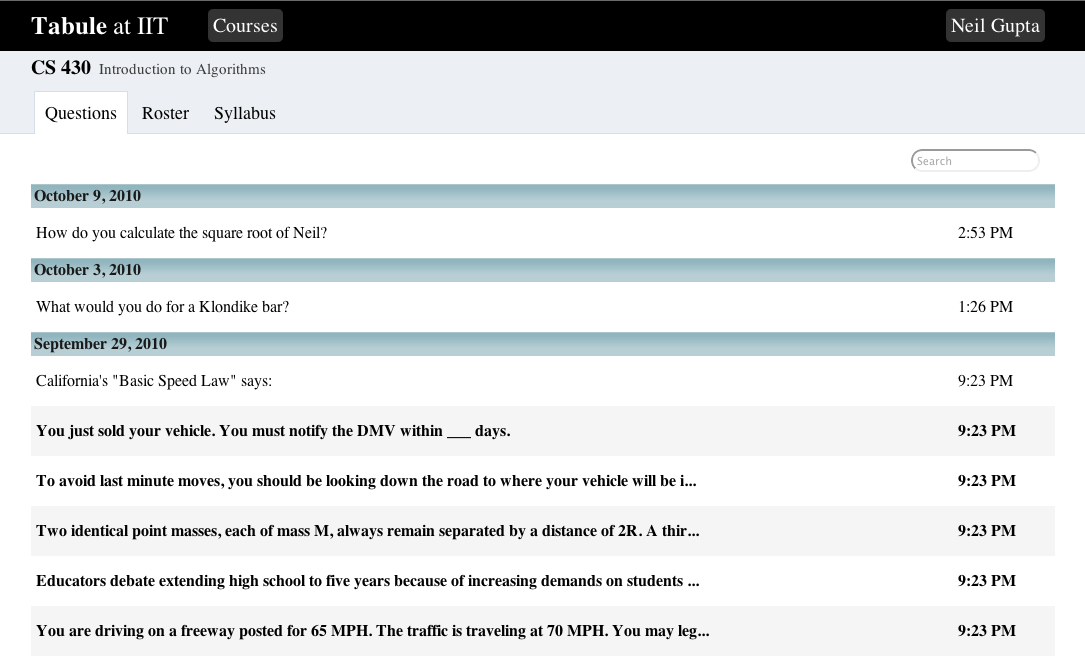
An early Tabule screenshot from October 2010.
Tabule v2
The next iteration added the ability for students to ask questions directly from their notes. The goal was to improve learning retention by providing a better note-taking tool, and also encourage students to ask more questions. The Q&A functionality received positive feedback across the board from students and faculty. They loved the low barrier to anonymously asking questions without interrupting the teacher. It resulted in higher engagement and far more questions being asked, which was great for everybody. On the other hand, the note-taking functionality failed to gain significant traction because students preferred to keep using whatever notes solution they were already accustomed to.
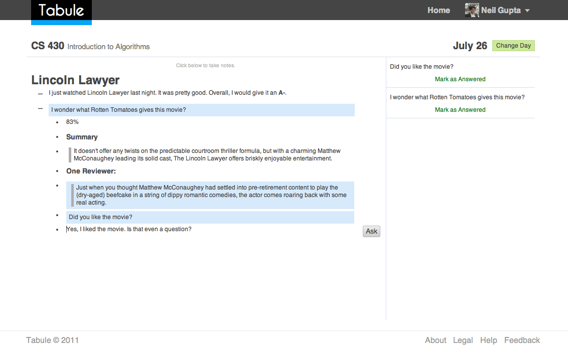
The student interface, June 2011.
In addition to the new student-facing features, I also redesigned the quizzing workflow for teachers. I created a card-based system that was designed to be as easy as Pivotal Tracker or Trello. Teachers created quiz cards and tagged them for easy searching. Before each class, they dragged the relevant questions into the queue and then asked them during class.
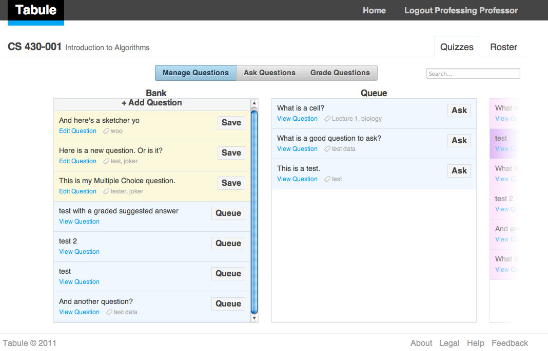
The teacher interface, June 2011.
Tabule v3
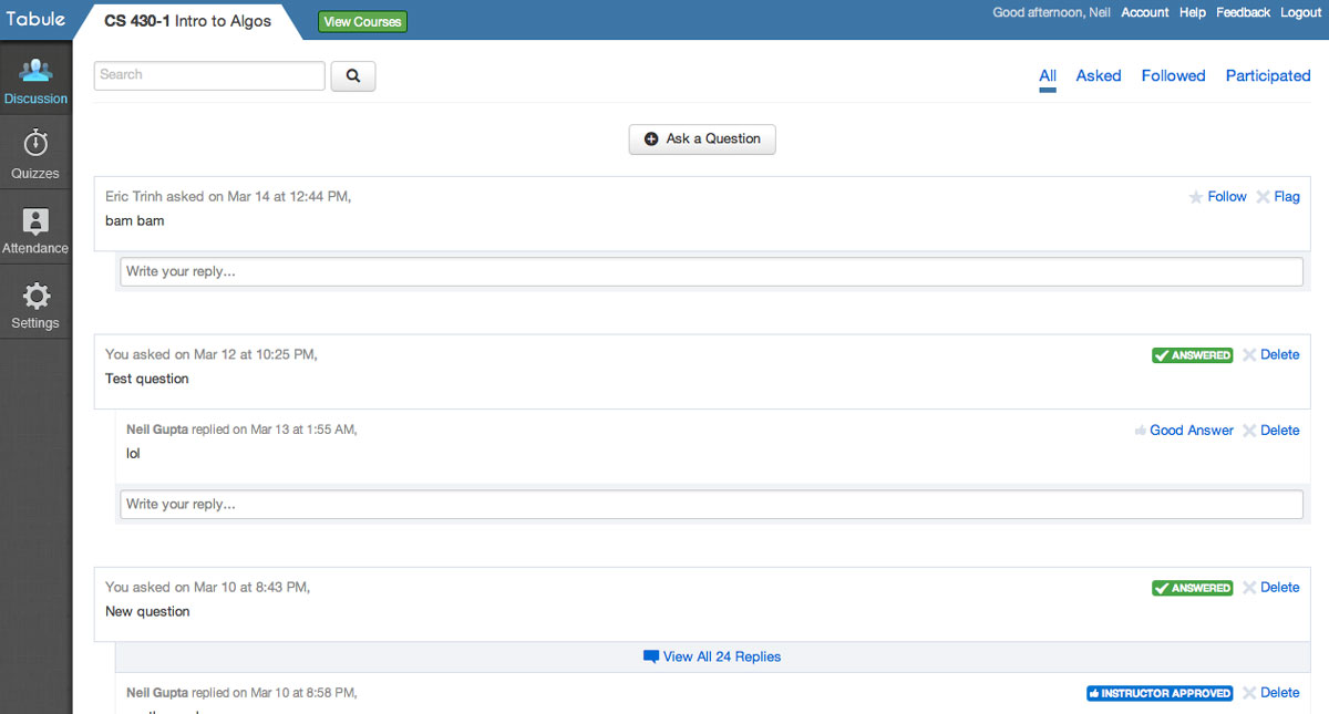
The third iteration dropped the note-taking functionality, and doubled down on asking questions and quizzing. Since Q&A was the main focus, I changed the interface to feel like a typical social network in order to reduce the learning curve. Teachers also gained the ability to make tests, which were basically a collection of quiz questions. Some professors used Tabule to completely replace their paper exams. They enjoyed the automated grading and easier distribution.
I used to get asked one or two questions from students. With Tabule, I get at least 20 questions per class.
- Professor Matt Bauer, IIT CS Department
Tabule, January 2012.
Tabule v4
In June 2012, I raised angel funding to continue working on Tabule full-time after graduation. The next iteration of the web app saw a significant visual redesign, as well as the addition of a collaboratively managed assignments calendar and announcements, because a lot of the questions asked in previous semesters revolved around due dates.
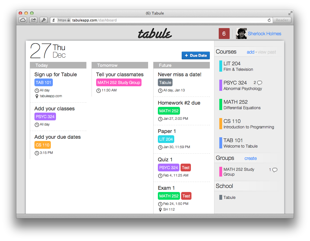
Tabule Dashboard, December 2012.
Tabule for iPhone
By far, the most requested feature was a mobile app, so I built an iPhone app to complement the web app. Within a few weeks after launch, the iPhone app was responsible for the majority of Tabule’s usage.
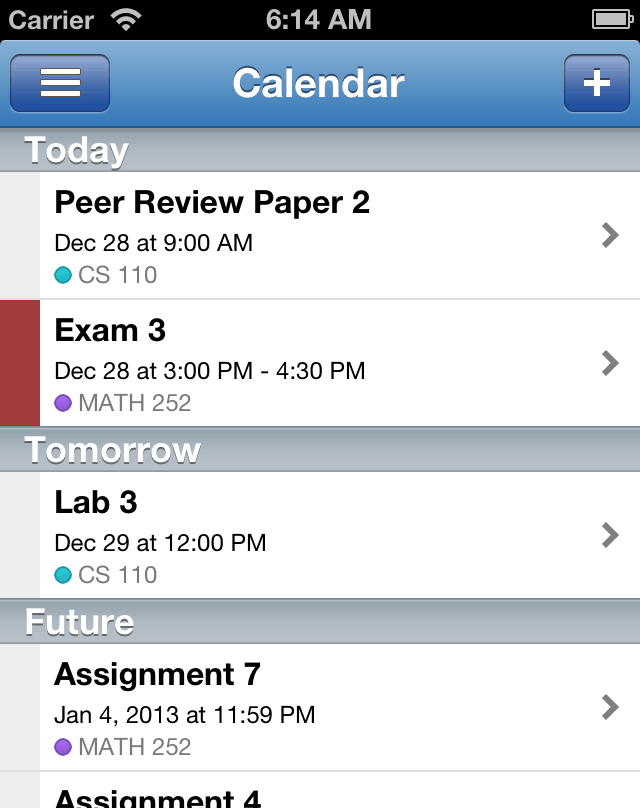
Tabule for iPhone, January 2013.
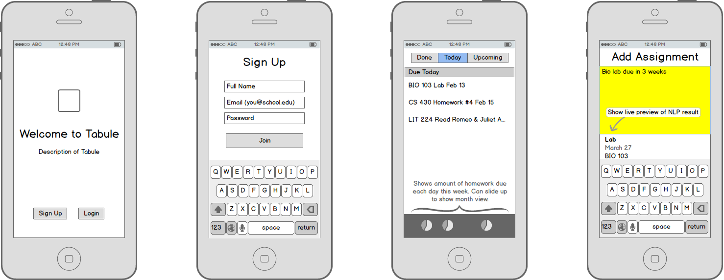
Designing the iPhone app
When I began designing Tabule’s iPhone app, it was meant to complement the existing web app. It didn’t need any complex setup or management flows, and could just focus on the content. My primary goal was to release it as fast as possible in order to have it in students’ hands before the new semester began.
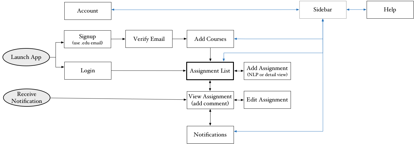
A quick workflow overview for Tabule.
Once I had identified the scope of the app, I began sketching different layouts.
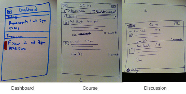
A few early sketches.
Wireframes of Tabule redesign.
The two most important screens were the Calendar view and the Add Assignment screen. Students add and view assignments daily, so it needed to be painless and fast.
Adding Assignments
A lot of assignments are missed because students write the due date in their notes and then forget to enter them into their planner later. I wanted to make adding assignments to Tabule as easy as jotting down a sticky note, so that students would add assignments to their planner directly. That meant there couldn’t be a form like other calendar apps that required students to poke at several fields just to add an assignment. Instead, I built Sherlock, a natural language date processing library in Javascript to be able to enter due dates in both the web and iPhone apps. Sherlock understands partial course names (e.g., “bio” completes to BIO 430) and a variety of date and time formats (e.g., October 27, in 3 weeks, day after tomorrow, etc) to make adding assignments foolproof.
Of course, designing the interface to be intuitive turned out to be harder than expected. First, I built a simple text field with a live preview of the parsed input.
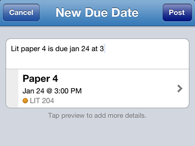
Adding Assignments in Tabule v1.0, January 2013.
However, it was not immediately clear what to do with the single text input. Students would enter the assignment title and then get confused how to enter the due date. I changed the text field to look like a sticky note instead with an example assignment as a placeholder to guide users.
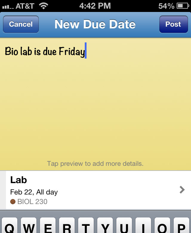
Adding Assignments in Tabule v1.2, August 2013.
More students were now able to figure out what to do with the sticky note, but it wasn’t perfect. To make the input even more intuitive, I removed the live preview and instead showed the three components that make up an assignment: course, title, and date. As the user enters their note, each of the components is filled in. If one of the components is missing, it turns red to catch the user’s attention. Users can then either add more text to the sticky note, or tap one of the components to use a task-specific interface. I also changed the yellow background to white in order to match iOS 7’s flat, less skeuomorphic aesthetic.
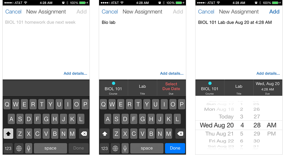
Improved flow for when user forgets to write a due date.
Tapping the date box shows a date picker and tapping the course box shows a list of courses the student is currently enrolled in. Selecting a date or a course from these UI’s updates the sticky note text so that the user sees how to enter the data faster next time. This interface has been very effective at helping students add their assignments as soon as their assigned.
Viewing Assignments
Since development speed was a high priority, I stuck with a mostly stock design for the first iteration. I simply showed a list of all assignments separated into 3 categories: due today, due tomorrow, and due later. Generally, students only care about assignments that are due today and tomorrow, so those were natural separators.
Viewing Assignments in Tabule v1.0, January 2013.
The biggest problem with this iteration was that it provided little interactivity. Students couldn’t mark assignments as completed so they still had to use another todo list to track what they still needed to do. Version 1.2 added swipe-to-complete to solve this. It also introduced an expandable dot chart to quickly visualize one’s upcoming homework load.
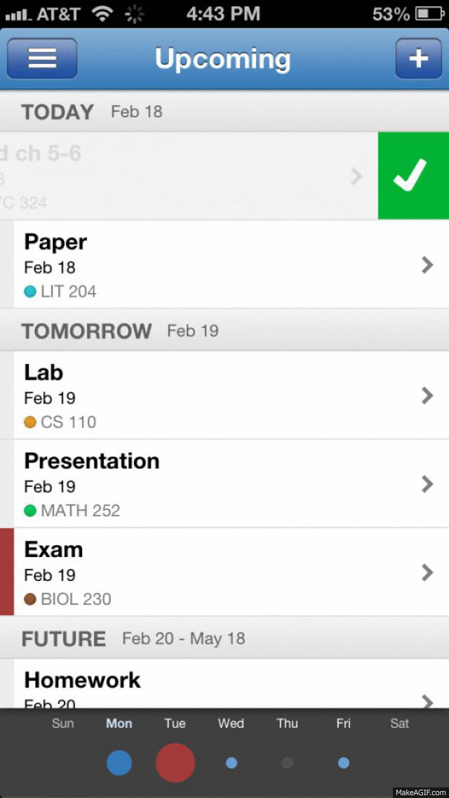
Viewing Assignments in Tabule v1.2, August 2013.
As mentioned above, students only care about upcoming assignments, so showing all their assignments for the semester in a single view resulted in information overload. Most other student planner apps solve this with a tabbed view instead of a grouped table list. However, that requires students to keep switching back and forth between the Today tab and the Upcoming tab to make sure they don’t get caught by surprise with a large exam or test. Instead, I wrote an algorithm based on principles from learning theories to choose which assignments students should focus on based on their difficulty. For example, you can generally complete a reading assignments the night before, but you should start studying for an exam at least one week before to maximize retention. The algorithm was also designed to reduce the need for all-nighters by spreading out the student’s workload, so that, in theory, the student would do the same amount of work every night, rather than procrastinating all the work to a single a night.
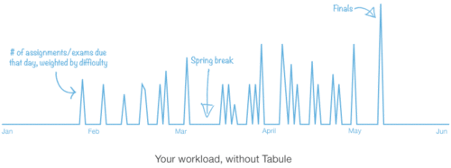
Spreading out your workload with Tabule.
The algorithm worked on a point-based system, so I designed an “Easy” to “Hard” scale to set the difficulty of each assignment.
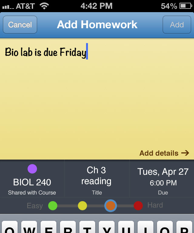
Mockup of setting difficulty when adding assignments.
This immediately felt wrong because it added another barrier to entering assignments. I am always against asking the user to do something if it can be automated. As a result, I used the two semesters of existing assignment data to create a simple heuristic for automatically calculating difficulty. This meant that without any changes to the interface, Tabule could tag assignments and suggest future assignments students should get a head start on.
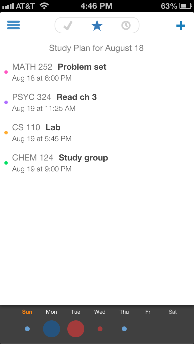
I cleaned up the interface for iOS 7 and separated assignments into 3 sections: completed, study plan, and future. Study plan consists of assignments that are due today, late, or suggested by the algorithm for today.
Viewing Assignments in Tabule v2.0, January 2014.
Since the algorithm works better with more data, I also added the ability to take pictures of your syllabus and have the due dates imported for you. Following the principle of do things that don’t scale, I currently manually enter those due dates for the user, though I have built internal tools to ease the process.
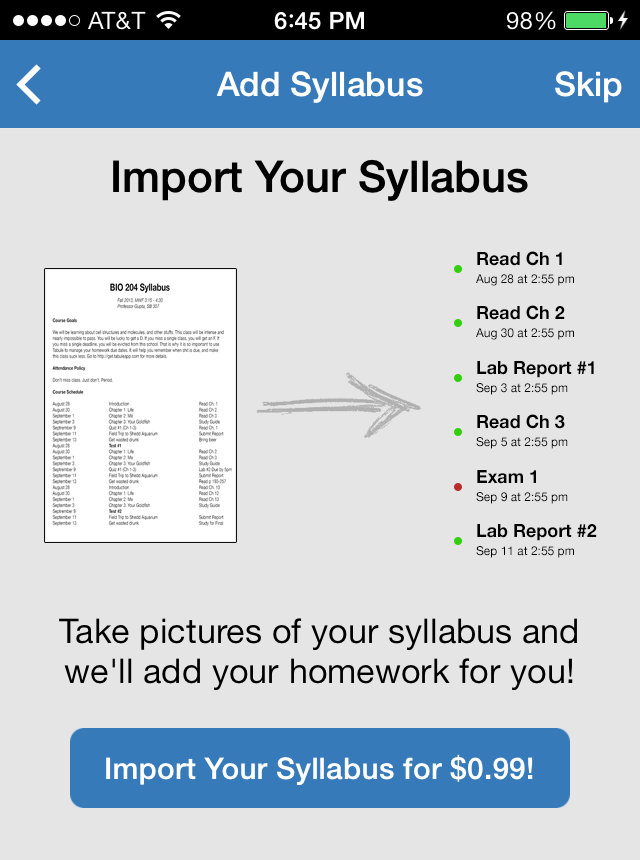
Import your syllabus with Tabule.
Feedback
Students are loving Tabule, and I get hundreds of emails at the start of each semester from happy users and from high school students wishing to use it. For the next update, I plan to simplify the onboarding flow, remove the .edu email restriction, and open up Tabule to high school students.
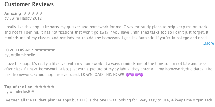
Latest customer reviews for Tabule on iTunes.
View Tabule in the App Store for the latest updates and customer reviews.