Copywriting 101
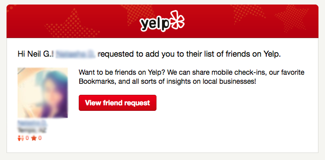
This is Yelp’s default message when sending a friend invitation.
It feels awkward and forced. Friends don’t share “insights on local businesses,” they recommend restaurants to each other. They don’t share “mobile check-ins,” they tell each other what they’re doing.
And while we’re here, why include my last initial when addressing me? And why is the button asking me to “view” the friend request? I will either want to accept the request or do nothing, so let’s make that the call the action.
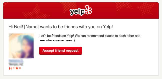
Here’s a revised version of what the friend notification email should look like:
This copy immediately makes it clear the benefits of accepting the friend request in words that matter to me, not to Yelp’s investors. It also has a friendlier feel and makes me want to click the call to action.
Copywriting is a very important and difficult aspect of any user interface, but even more so in email notifications where you’re competing with their other emails for attention. Good copy can make or break a product. Some might argue that it’s the most important aspect of your app because it defines the tone and mindset that users will approach your product and communicate about it.
Make sure your copy was written for your users, not your pitch deck.

