Gamifying Gogo's Customer Acquisition
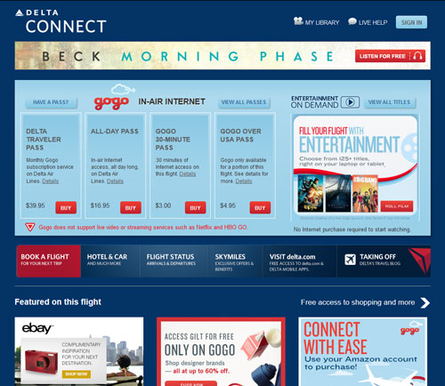
Last weekend, I attended a Gogo hackathon organized by Monkeybars. Most of my time was spent playing board games, watching movies, and just hanging out, and I did not intend to actually compete in the hackathon. But then I saw the following screenshot of Gogo’s in-flight portal on a Delta flight.
To put it lightly, this portal sucks. There’s no significant call-to-action. The large “buttons” for in-flight entertainment, eBay, and others look more like obnoxious ads that might as well say “Find single ladies in your area.” It’s not immediately clear what else I should do once reaching this page, and even if I manage to focus on the boring blue boxes, read the small text, and purchase a wifi pass, I leave that page and have no more connection to Gogo after that.
I ended up working with a friend to see if we could improve Gogo’s customer experience by gamifying the user onboarding flow. We spent the next couple hours interviewing Gogo executives to fully understand their business problems and goals. One interesting fact was that Gogo has more users than it can handle already and is not worried about attracting new users. Instead, their problem lies in getting people to interact with the brand more and build brand loyalty. In particular, business users tend to be price insensitive and will use Gogo no matter what. Casual consumers, on the other hand, do not interact with Gogo at all. How can Gogo engage casual consumers while still catering to their primary business clients?
With this in mind, we whiteboarded a user flow diagram, and decided to quickly mockup one possible flow.
The Redesign
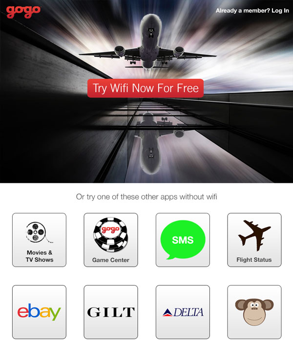
This is the first page users will see when they connect their device to Gogo’s wifi. The background image evokes thoughts of speed, which will then be associated with Gogo’s brand and their wifi. The large red button makes it immediately clear what they should do next1.
Scrolling down, users will see a list of services that Gogo and Delta offer without requiring a wifi pass, presented in a familiar app screen format. On an airplane, users are a captive audience that can afford to spend time exploring, so an inviting list of new apps will be more tantalizing than large, obnoxious ads.
Alright, now we’re ready to try something new.
The Gamification
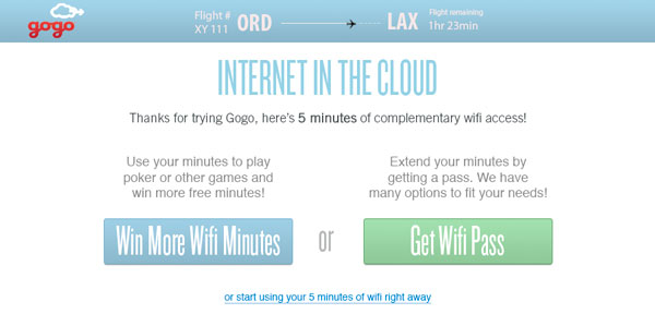
Once tapping the try wifi now button, the user is awarded five free minutes of wifi. The goal here is to give users a taste of Gogo’s product, as well as to gamify the purchase process. Users have three choices:
- Use their free five minutes right away. This option is de-emphasized with a small link at the bottom.
- Purchase more minutes or unlimited passes. This option will be used by business travelers who are price insensitive or customers who already know what they want.
- Play games to try to win more minutes.
Let’s look behind door #3.
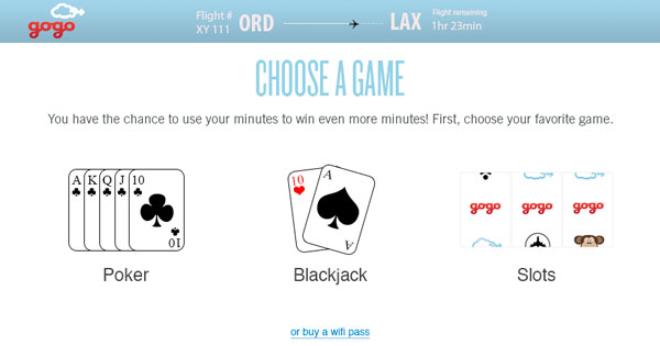
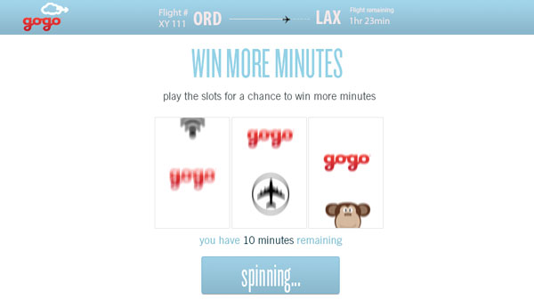
What do you do when you get five free minutes? You gamble it away of course!
We chose 3 basic and well-known casino games, ranging from high to low strategy. For poker, users would be able to play with other passengers on the same flight, adding a social element to the game without taxing the limited bandwidth. The goal here is to keep users engaged with the Gogo brand, while also driving them to purchase more minutes to keep playing once gambling psychology kicks in.
In this slots example, each spin costs the user 20 seconds of wifi time to play. There are two possible outcomes: either the user gets lucky and wins minutes, or the user goes broke eventually and must buy more minutes to keep playing. This whole time, the user has continued to see and engage with Gogo’s brand.
From Gogo’s perspective, this strategy costs very little, but it provides an opportunity to hook customers with games or to give them a taste of internet access in the sky. It will be very tempting to purchase a wifi pass once you’re already chatting with friends on Facebook, or in the middle of a heated poker round. More importantly, if you know that you’ll get 5 minutes of wifi just for connecting your device to the network, you’re also more likely to see Gogo’s other services, like their in-flight movies, than if you never bother to even connect your device. From the cusomer’s perspective, Gogo becomes a more friendly brand, rather than the company that charges too much for wifi.
There are of course still gaps and issues that need to be worked out, but for a few hours of work, I think this is an interesting take on the Gogo onboarding flow. The audience seemed to agree because we won the Peer Choice award2 at the hackathon.
The Pitch
And here’s our final pitch!
-
This button would be customized based on Gogo’s business goals per flight. For example, on busy flights where the wifi usage is already maxed out, this CTA could encourage users to check out Gogo’s movie library or games instead. ↩
-
Peer Choice was determined by votes from other participants. We also received honorary mention by the judges, who liked our presentation (which had more screenshots than shown here) but could not pick us for first place because we didn’t actually code anything. ↩
